Project Scope
Graphic Design
Branding
Motion Graphics
Role
Independent Designer
Timeline
3 months
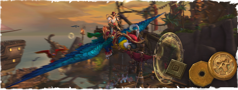
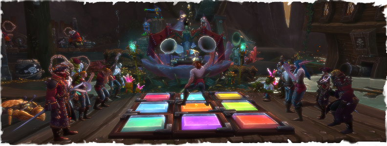
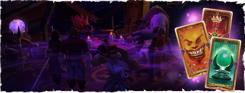
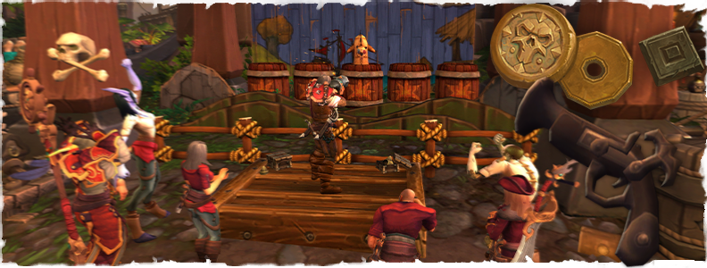
This personal project involved creating a pirate-themed game zone, Plunder Isle, within the World of Warcraft universe, using both custom and kitbashed assets. The zone itself is designed as a self-contained experience with detailed environments, interactive elements, and a custom game mode inspired by Plunderstorm. It encourages exploration and supports a range of playstyles, including combat, questing, mini-games, and puzzle challenges, while incorporating narrative elements throughout.
To showcase the zone, I also created a mockup logo and teaser video, maintaining a consistent and visually striking brand identity for Plunder Isle.
⚠️Disclaimer: World of Warcraft and Plunder Isle are the property of Blizzard Entertainment.
Deliverables included:
✅ An explorable, immersive game zone.
✅ Various graphic assets for in-game and marketing purposes
✅ A teaser video highlighting the zone’s features
Teaser
Brand Identity
Plunder Isle is an existing location within World of Warcraft’s lore, but one that has never been visually depicted in-game. This provided an opportunity to develop a unique visual identity and establish how the island would be represented as a fully realized environment.
I sampled a colour palette of muted gold, rose red, and jade directly from in-game textures as the foundation of the brand identity, with each colour representing a key aspect of the island: treasure, danger, and mystery. Jade also became an important narrative element within the world itself, with the island’s inhabitants using jade in place of traditional glass for windows, drinking vessels, and other everyday objects.
Beyond individual design choices, my goal was to create a cohesive visual language that made every element feel like it belonged to the same world. Research into Plunder Isle’s existing lore, the Bloodsail Buccaneers, and pirate aesthetics across other forms of media helped inform the overall direction, ensuring both familiarity and a distinct sense of place.
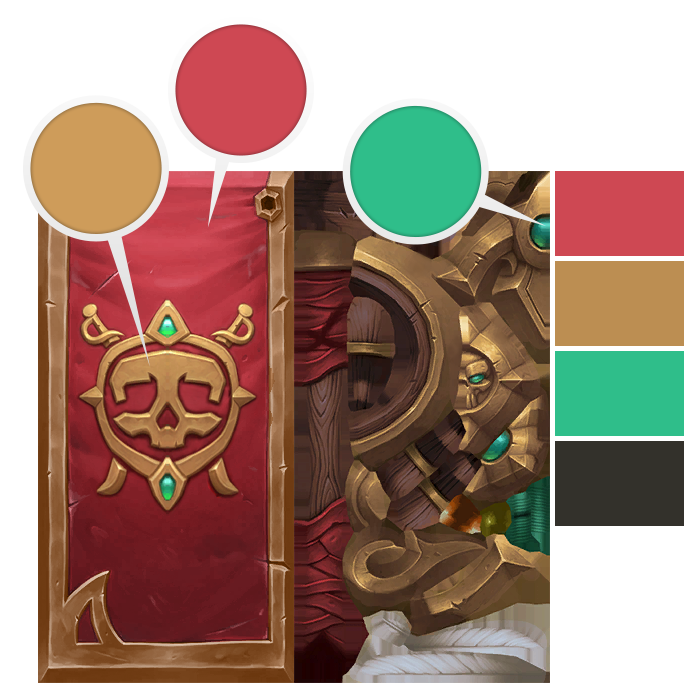
Plunder Isle’s colour palette.
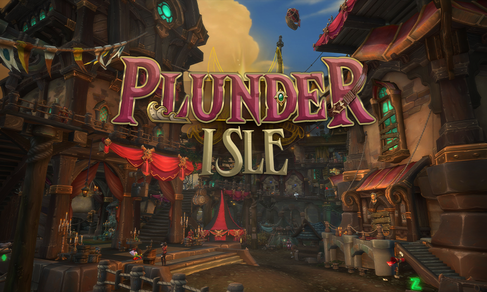
A logo treatment for Plunder Isle, featuring various pirate-themed accoutrements.
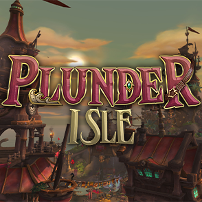
A smaller avatar version of the logo for social media.
Character Designs
In order to make Plunder Isle feel like a living, immersive world, I also illustrated character designs for some of the more prominent residents of the island. These concepts later helped me shape the personality and in-game appearance of these characters.

A character silhouette for Duke Falrevere, the smarmy pirate-lord of Plunder Isle!

The Duke’s daughter, Jessi Falrevere, Captain of the Red Queen.

The goblin Commodore Greely (top left) and his first mate, the ogre Beck’rick (bottom right).
Icons
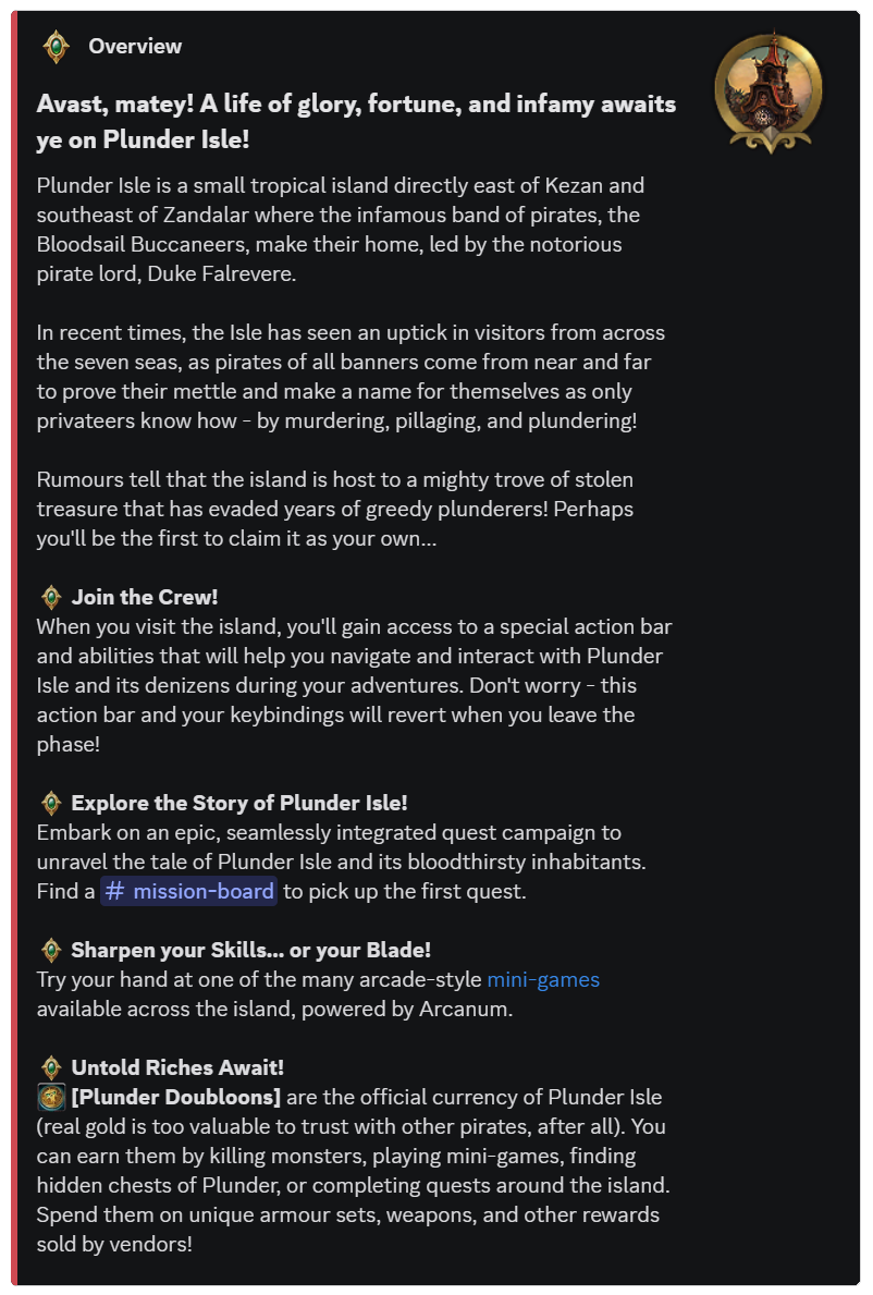
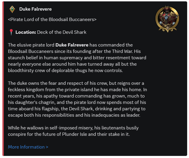
I developed a collection of custom icons to support Plunder Isle’s social media presence, creating visually engaging assets that helped communicate character details, world-building, and updates while still maintaining the project’s overall visual identity.





Zone Map
Although Plunder Isle is a relatively small island, its dense environments, towering structures, and hidden discoveries create a world full of points of interest. To help players navigate the zone while encouraging exploration, I designed a stylised map that highlights important landmarks and key locations throughout the island.
The map was created to evoke the feeling of an authentic treasure map, using illustrated landmarks and decorative details to reinforce the pirate theme while presenting information in a clear and intuitive way.
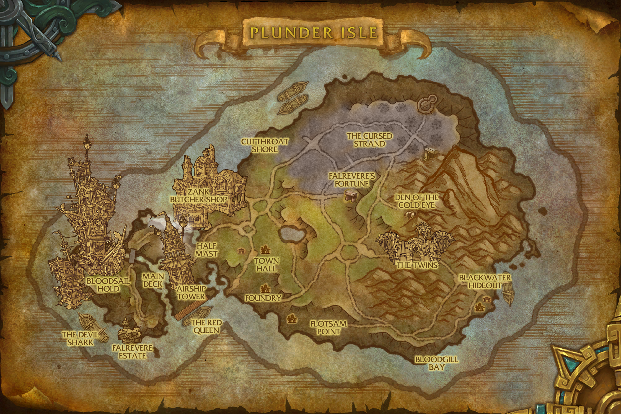
The in-game zone map, created with Adobe Photoshop.
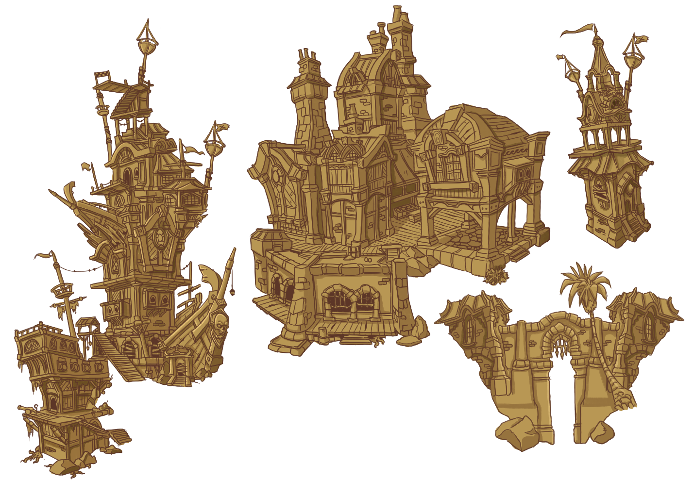
Stylised illustrations of important landmarks, created with Photoshop.
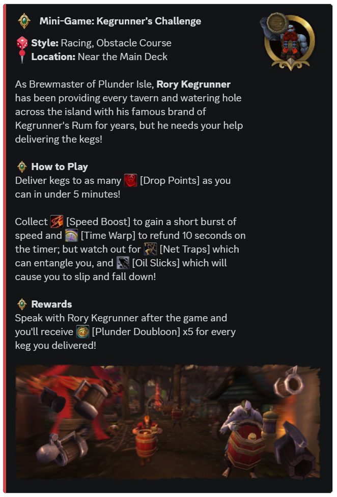
Mini-Game Banners